Not too long ago, there was a great debate between two sides of the web. The “Responsive” web vs the “m.” web. One pushing for a single codebase that responds to user-context and another pushing for a second, mobile-only approach (typically using a subdomain starting with m.) It’s clear now, the responsive web has won.
A Retrospective — Responsive Design
The mark of a master woodworker is his/her ability to work with the grain. The grain gives the wood its natural identity and subtly tells the craftsman the best way to work it.
Work with the grain and save effort. Work with the grain and maximize flexibility. Work with the grain and maintain strength.
Work against the grain at the expense of additional effort on the part of the craftsman as well as reduced flexibility and strength in the wood.
The same can be said for crafting products on the web. The raw materials are HTTP requests, HTML, text, CSS, Javascript, images, and motion.
To go with the flow of the web-grain is to deliver content quickly, with vertically-variable content-flow. Reduce HTTP requests and add complex functionality using progressive enhancement.
The tools that we design should be user-centric and our metric of success is when our user puts our tools down. In the end, we want our users to be engaged with the people and world around them, not fumbling with a tool. The tools are a means, not an end.
s/Techn/Method/ology
Server-side web frameworks like Django, Ruby on Rails, Express all have
excellent technologies to define explicit dependencies (e.g., pip with
requirements.txt, gem with Gemfile, and npm with package.json.)
Configuration management tools like Chef, Puppet, Ansible and Docker are making
the server-environment both easier to define implicit dependencies and help
automate the task of creating homogeneous development and production
environments. Together, these tools can build a reproducible execution
environment where the code can be more fully tested in a space with less far
less entropy than the web environment.
The execution environment of the web is extremely heterogeneous: it operates on a fractured multitude of devices within a dozen of browser of various capability. Bandwidth, CPU speed & memory, screen size & pixel density are just a few of the multitude of variables web developers need to manage. This diversity of environment makes for some very complex problem-solving, but that very heterogeneity is the grain of the web, it’s what gives it resilience and staying-power; it’s the power of decentralization at work.
Responsive design was born out of the complexity and diversity of the web. It is not a technology but a methodology used to cope with the diversity of environments a web product needs to operate within.
We use this methodology to engage in conversation that is optimized for each of our users. We do this by taking device-capability, user attention-levels and context into account; and designing specifically for these variables. This is opposed to the familiar approach where we send a canned “one-for-all” solution to everyone (and yet no-one in particular.)
“It’s important to note the different between support and optimization. Optimizing for every web-enabled device on earth is impossible, so eventually you need to make the strategic (read: business) decision of what target devices and browsers for which to optimize.” —Brad Frost
If we bifurcate our web experiences into arbitrary “web” and “mobile” buckets, we will then be forced to decide which bucket any new device best fits in. Can we really continue to commit to supporting each new device (as the market continues to fracture) with a bespoke experience? Doubtful.
Instead we should shift our thinking: How can our designs best-adapt and flow into the context and environment in which our users operate; in order to best serve the goals of the user?
“The control which designers know in the print medium, and often desire in the web medium, is simply a function of the limitation of the printed page. We should embrace the fact that the web doesn’t have the same constraints, and design for this flexibility. But first, we must ‘accept the ebb and flow of things’.” -John Allsopp, “A Dao of Web Design”
Up front we should make an important distinction between “responsive design” and “web design”; namely that experience design is about purpose, while web design is about graphic aesthetics. (Most often, “web design” is just a reference to a picture, a design comp.)
While the design comp can refer to the aesthetics of the product, it doesn’t communicate its essences of motion, interaction, performance or scalability. Often times this communication exists completely outside the comp (in a discussion or meeting), or alongside it. The evidence of this gap in communication is the reliance on design-document annotations using the following words:
- “Fades”
- “Jumps”
- “Flips”
- “Shrinks”
- “Collapses”
That said, when considering whether or not to implement experience design into business strategy, a major trade-off to keep in mind is that marketing and graphic design stakeholders will be relinquishing control to other stakeholders. An experience-oriented approach can make the marketing team out feel like they’ve been taken out of the driver’s seat. The graphic design team needs to be ready for a challenge, amicable to iteration and prototyping as well as forgiving about variability in the final outcome.
In order to advocate for the grain of the web, our job must become political and inclusive. We need to use sensitivity, language and organizational politics to get all stakeholders to reach consensus.
“Like celebrities on the cover of a magazine, ‘pixel-perfect’ execution on the web is only ever achieved in Photoshop.”
What “Responsive design” Is
- A process
- A relinquishing of the false sense of comfort we get when designing for a “design comp”
- An experience-first / MVP friendly approach to building dynamic, consistent and importantly a complete experience that adapts to users context
- A conduit for the flow of of communication, and much much like water, it flows into different browsers & devices, flows into robot search engine crawlers, flows into RSS feeds, flows into meta-data (hReview) parsers, flows into printers, flows into read-later tools like Web Clippings, Pocket, Instapaper and FlipBoard
Responsive Design as a catalyst for organizational change
Responsive design is more of an organizational challenge than a technical challenge.
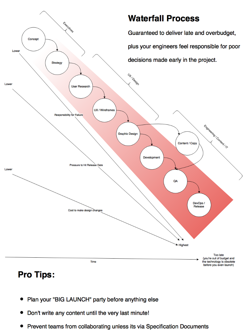
The challenge for teams structured traditionally into Business, Product, UX, Design, Development, QA is that they operate in a waterfall process, with little-to-no feedback cycle and a lack of cross-disiplinary team member involvement. Accountability to the result moves top-down and never bottom-up. Product has little push-back on business, UX has little weight to affect product decision, and then down the waterfall, design has little affect on the UX decisions. Once in development, the dev-team has little affect backwards up the chain. This always guarantees last-minute compromise and needless wasted effort.

As the workflow gets closer to Launch, changes to the design become more and more expensive. This creates an expensive, rigid and compromised final product. Most importantly, the end-users aren’t impressed and team members are annoyed with all the compromises made. Nobody is happy.
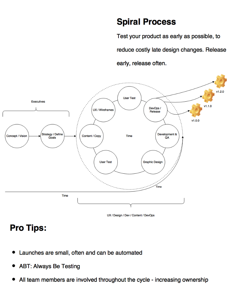
Using a cross-disciplinary, phased collaborative approach, we benefit from deliverables that can validate our decisions much earlier in the process, and importantly- those decisions are less complex (read: less expensive) to change.
This process is called the Spiral Model Process and it goes hand-in-hand with Responsive Design Methodology. All team members are involved in the development of the product early and often. Team members feel like they have more input on a wider aspect of the product, and this results in higher levels of personal responsibility and acts as an intrinsic motivator for all team members.

Just remember, Responsive Design isn’t a set of CSS features, a technology stack or a set of tools. Its when an organization decides to collaborate around a process; with accountability to the user first, to each other second, and to solve the technology last, once all important decisions have been made.
More reading on “Responsive Design” and organizational change
- Upstatement & Filament Group discusses their approach to the redesign of the Boston Globe
- Matt Andrews on the responsive redesign at the Guardian UK